New and Improved? How You’ll Know It’s Time to Update Your Blog
It can get addicting buying new themes for your blog. There are just so many designs out there, how do you pick just one?!
When you’re looking for the perfect theme for your WordPress blog, there are some very important features you should NEVER skip.
Unless you don’t care about Google and SEO which is just crazy talk.
Before I get into that, a little backstory…
WAAAYYY back in the day, aka 2010, Bre Pea used to be Peacoats and Plaid. No, it wasn’t a fashion blog. Yeah I know, that makes no sense. If you’re really curious where the name came from, check out a super old vlog I made explaining the whole thing.
This was back when most people were on Blogger, learning simple html was enough to create your own blog design, and the term “influencer” was years and years away from being a “thing”.
Blogging was much more about self expression and making connections with other fellow bloggers than monetization and raking in the dough. I kind of (really) miss those days.
Here I am 8 years, 2 names, and uncountable layouts/designs later. I moved my entire blog over from Blogger to WordPress back in 2016 (which was about 4 years too late and as a result was WAY HARDER than it should have been) and since then I haven’t really felt truly happy with the look. Until now 😀
Enough about me, for now, how will you know when it’s time to update your blog design?!
You can’t easily organize your home page for quick navigation
I wanted my home page to be solely a place for organization and navigation. My old theme was OK, but there were a lot of things that weren’t so spiffy. My menu bar was really hard to navigate on a phone, for one.
If you’re finding it hard to organize your blog so people can find your content super easily, it’s time to look for a new design.
Your blog design isn’t mobile responsive
What I mean by mobile responsive, as you probably already know, is that it can automatically detect which device is accessing your blog and adapt/optimize the layout for the screen size.
Google shows favor to websites that are mobile responsive, so if you’re using SEO as a means for traffic (which I hope you are!) you better make sure your theme is mobile responsive.
Your design uses fonts like Comic Sans and Papyrus
If you purchased a design/theme that uses such mortal sin fonts as Comic Sans or Papyrus, demand a refund immediately lol
But in all seriousness, if your blog currently violates any design crimes like bad font choice, too big or too small font, not enough white space (all of which affects ease of reading) it’s time to reevaluate.
Your blog loads SUPER slow
This is something I didn’t pay super close attention to but wish I had. My blog was never the quickest to load, but I always attributed it to my slow internet connection or the fact that I needed to work on compressing my images.
Once I learned that Google penalized slow loading sites (not to mention bounce rates are directly related to slow site loading speeds) I put site loading speed at the top of my list.
After not being fully happy with my first WordPress design and searching for hours and pinning multiple new options, I finally found the theme of my dreams.
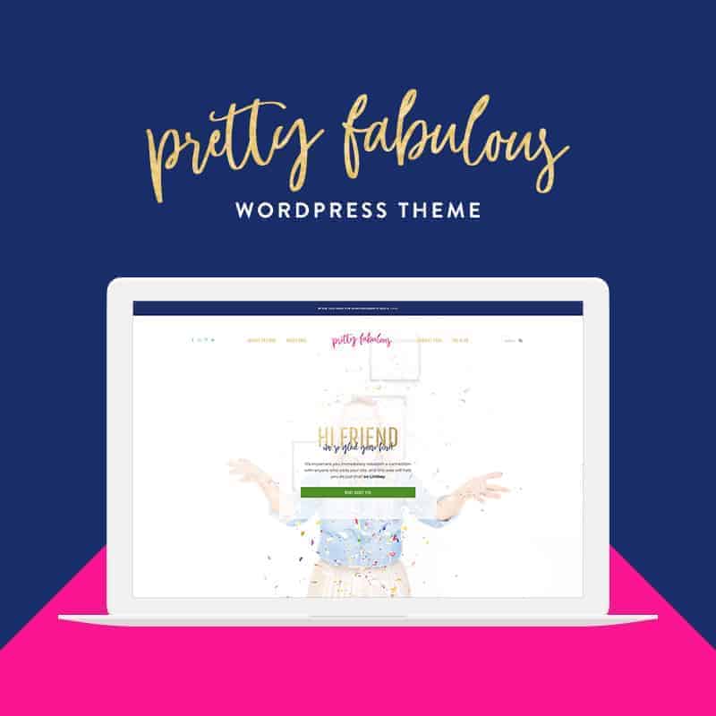
I purchased my latest theme from Lindsey at Pretty Darn Cute designs and I’m finally proud of the way it looks. I went with the Pretty Fabulous theme because of a few reasons:
- I already liked the fonts she used (less tweaking I had to do!)
- Super fast loading speed
- I loved the fade effect between home page widgets
- Sticky header and menu bar
- Customizable “hey bar” at the top included
- Built in related posts (my last theme didn’t have this)
- …and many more!
Don’t get me wrong, the blog is still a work in progress. When I moved over from Blogger there were over 400 posts to weed through and edit to make sure all carried over nicely. Spoiler alert: it didn’t and I’m still going through posts 2 years later.
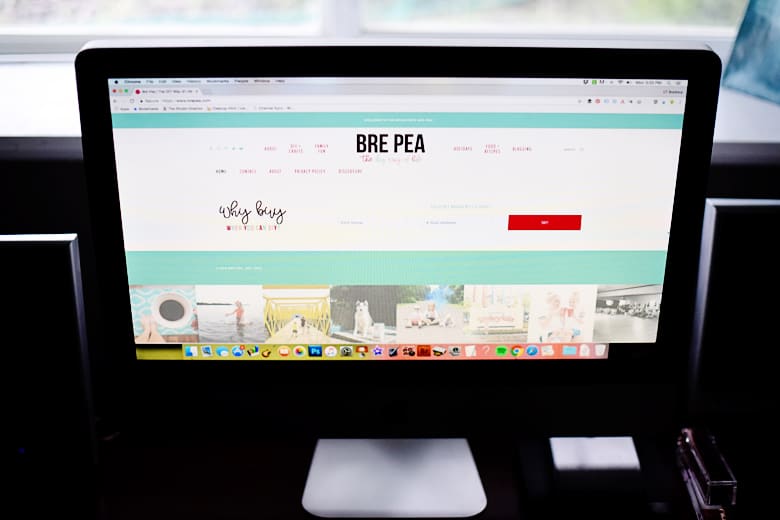
But, I’m a firm believer that published is better than perfect when it comes to large projects like a do-it-yourself blog redesign. I’ll be making little tweaks here and there, but overall I’m proud to share the new and improved Bre Pea!


These are such good notes. I am constantly looking over my blog, and making changes as possible.
This is so helpful! I need to do an audit of my site soon.
love these ! I have gone through maybe 3 designs in the past year lol. I have yet to change my name though…but who knows!!!!
Well, your blog looks fantastic, so I definitely trust your judgment!
Aww, thanks so much Cassie!